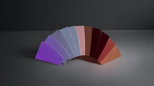
The transition from Digital Lavender to Rust Iron Red in the 2025 autumn/winter key color palette marks a fascinating evolution in seasonal aesthetics, blending the ethereal with the earthy in a narrative that speaks to both technological advancement and a return to raw, natural elements. This shift is not merely a change in hue but a reflection of broader cultural and design movements, capturing the zeitgeist of a world balancing digital innovation with a craving for authenticity and tactile experiences.
Digital Lavender, a color that emerged from the intersection of technology and wellness, has dominated recent palettes with its soothing yet futuristic appeal. This shade, often associated with calmness and digital serenity, represents the ongoing integration of technology into daily life, particularly in spaces designed for relaxation and mental well-being. Its soft, luminous quality evokes a sense of tranquility, making it a favorite in everything from fashion to interior design. However, as we move deeper into the decade, there is a palpable shift towards colors that ground us, that speak to resilience and the raw beauty of the natural world—hence the rise of Rust Iron Red.
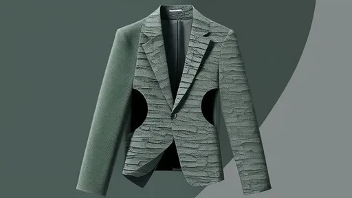
Rust Iron Red, with its rich, oxidized tones, brings a sense of warmth and durability to the palette. This color draws inspiration from industrial elements and aged metals, embodying a rugged elegance that contrasts sharply with the softness of Digital Lavender. It is a color that tells a story of time, wear, and strength, resonating with a growing appreciation for materials that age gracefully and designs that prioritize longevity over fleeting trends. In fashion, Rust Iron Red is appearing in heavy fabrics like wool and leather, while in interiors, it adds depth and character to spaces, often used in accents that evoke a sense of history and craftsmanship.
The transition between these two colors is not abrupt but rather a gradual blending, a gradient that mirrors the complex relationship between our digital and physical realities. Designers are exploring this transition through ombré effects, layered textiles, and complementary color schemes that allow Digital Lavender and Rust Iron Red to coexist harmoniously. For instance, in apparel, we see pieces that start with a soft lavender at the top and deepen into a rusty red at the hem, creating a visual journey that is both striking and symbolic. This approach acknowledges that our lives are not defined by binary choices but by the fluid integration of opposites—digital and analog, new and old, delicate and robust.
In terms of cultural context, this color shift aligns with a broader movement towards "neo-analog" lifestyles, where individuals seek to balance screen time with hands-on, tangible experiences. Digital Lavender, born from the glow of screens and virtual spaces, meets its counterpoint in Rust Iron Red, which evokes the tactile sensation of touching weathered metal or walking through autumn leaves. This duality is particularly relevant in a post-pandemic world, where there is a renewed emphasis on finding equilibrium between the convenience of technology and the irreplaceable value of physical presence and natural materials.
The application of these colors extends beyond fashion and interior design into product design, graphics, and even digital interfaces. Tech companies, for example, are incorporating Rust Iron Red into device casings and accessories to convey durability and sustainability, while soft lavender hues remain in UI elements to maintain a sense of calm usability. This cross-industry adoption highlights how color palettes are increasingly used to communicate brand values and user experiences, with the 2025 autumn/winter palette emphasizing a blend of innovation and tradition.
Moreover, the emotional resonance of this transition cannot be overlooked. Digital Lavender offers a escape, a moment of peace in a fast-paced world, while Rust Iron Red provides a sense of anchoring, reminding us of the enduring qualities of the physical world. Together, they create a palette that is both forward-looking and nostalgic, capable of evoking a range of feelings from comfort to strength. This emotional depth is why these colors are being embraced by consumers and designers alike, as they seek to create environments and products that are not only visually appealing but also meaningful.
As we look ahead to autumn/winter 2025, the journey from Digital Lavender to Rust Iron Red is set to define the season's aesthetic landscape. It is a transition that celebrates contrast and harmony, offering a rich tapestry of possibilities for creative expression. Whether through a bold rust-colored coat paired with lavender accessories, or a living room that combines plush lavender textiles with iron-red metallic accents, this palette invites us to explore the beauty of duality and the stories that colors can tell.
In conclusion, the 2025 key color palette is more than a trend; it is a narrative of balance and evolution. From the digital realms represented by lavender to the grounded reality of rust red, these colors challenge us to find beauty in transition and to embrace the full spectrum of experiences that define our modern lives. As designers and consumers continue to experiment with these hues, we can expect to see innovative applications that further blur the lines between the virtual and the visceral, creating a future that is as nuanced and layered as the colors themselves.
By /Aug 21, 2025

By /Aug 13, 2025

By /Aug 13, 2025
By /Aug 13, 2025
By /Aug 13, 2025
By /Aug 13, 2025
By /Aug 13, 2025
By /Aug 13, 2025

By /Aug 13, 2025
By /Aug 13, 2025
By /Aug 13, 2025

By /Aug 13, 2025

By /Aug 13, 2025

By /Aug 13, 2025

By /Aug 13, 2025
By /Aug 13, 2025
By /Aug 13, 2025
By /Aug 13, 2025
By /Aug 13, 2025

By /Aug 13, 2025